Dy/Dan Annual Report Part Deux
It’s that time of the year, Contest: My Annual Report II is back at Dan Meyer’s blog. I thought he might skip it in light of his recent wedded bliss, but he just used it as an opportunity to create an infographic on Mobile Calls to his now wife. The idea is comes from Nicholas Feltron’s Annual Report which is based on the idea of graphing the minutiae of your everyday life to show what you’ve done for the year.
Without further ado, here is my entry:


Now, for my reflections on this. When Dan posted Nicholas Feltron’s 2008 Annual Report there was some commentary on the aesthetics of Feltron’s report, that I exploited in my version. Feltron’s report featured two things that challenged the eyes of the bi-focal set, small fonts, and a light grey type on dark grey color scheme. I decided to go with the grey on grey, but reversed it to make the type the darker of the two, which is more traditional and easier to read, but based on these observations I added my own “mosquito tone” visually. I hid some text in two of the slides in a small font in a faint grey shade. It was a “cheeky” move with the first slide, where I had subtitles, “I took a plane” and “I took a train” and the “hidden” text read “(ah, who cares, you always end up in the city?)” which is from the New Pornographers, “Myriad Harbor” a song more recognizable to folks better able to read the text without an magnifying glass.
I only had two infographics. Why? I don’t keep a spreadsheet with the minutiae of my life. I know that some consider this useful, or therapeutic. In my family, it usually comes with a three letter acronym diagnosis from the DSM IV. No aspersions on Dan or Mr. Feltron, but I’m not into that. What I’m more concerned about is, what story does it tell? I’m not a stats major, but I have worked with basic ratios and done work in public opinion polling, and there is good and useless information in numbers. On Mr. Feltron’s report, it’s not always clear to me what his point is. While others knocked his style (the grey on grey), I think his work is gorgeous. It has a similarity to the sans-serif graphics of graphs from good.is, but I think they do a better job of conveying meaningful and complex information.
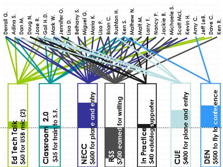
The one slide that Dan has up on phone calls is an EXCELLENT example of what I’m looking for. Maybe it’s because I know the back story? Anyway, I opted to use whole slide pictures to convey story and context. The first slide is about the trips I took to conferences in terms on numbers using miles traveled, I then went to a slide showing one of the places I went to Belleville, PA, where I got to meet some of my aunt’s friends who are Amish. This was a big culture leap in a way that can’t be expressed in numbers.
The next two slides were about money, and relationships in the context of my online professional network. First, I looked at how much I spent or made from each conference/network, and how many people I connected with meaningfully. My inspiration was the TweetWheel. If I left someone off, I apologize, it was a seat of the pants thing. Then I slapped a big off center pic of Dan up and stole the old MasterCard “priceless” line to contrast with the dollar figures. Maybe it was a little bit of sucking up to use that particular pic, but I liked it visually.
So there it is, my 2008 for better or worse. I strongly urge you to look at participating or trying to make at least one slide, just to play with the idea. It couldn’t hurt?


Hi Alice,
Seeing your story-not-stats slides might get me doing this again for 2008. (We’ll see what next weekend holds.) Thanks for being on top of things to provide the inspiration.
Well, I did have to look up airline mileage, round up some expenditures, and draw all those damned lines, lol, so story or no Sarah, it’s some work.
Work, completely true. But I at least sketched out my drafts last night. Decided I’m not showing the numbers, whether I know them or not.
@Sarah, well, that seemed to work for a lot of the market valuations that were done in the last few years, why not make ’em up! Can’t wait to see it.