Annual Report redux
Like the last Dy/Dan contest, I did another version. This one follows the rules and looks more like the examples provided by Dan and company:

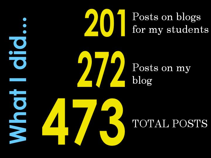
Frankly, I could have spent more time tweaking this and that. I considered creating my own graphics to show how my use of paper had decreased with paper ream and box icons, but in the end, this project is a dead-end. It does not speak to me as the first one did. I think that Dan has set up a great goal by having us work on how we present numbers, etc. but for me, it was the words that really said the most. When I look at some of these slides they seem facile and superficial (especially that one on the number of posts written). A splog can generate lots of posts, so that is no accomplishment imho, unless you have some quality in your writing to back it up. I guess I feel like the first preso is more about quality, and this one is about quantity.


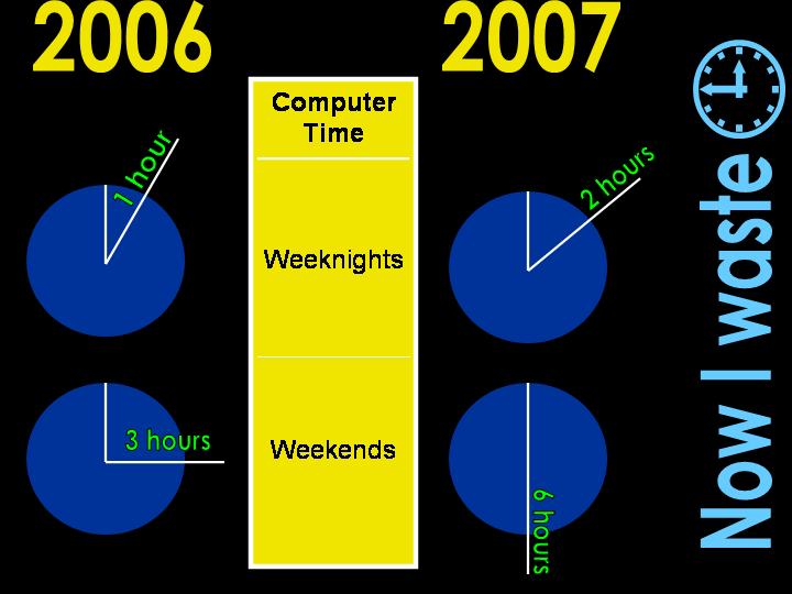
Well, Dh hates “wasted” in slide two and three, and would prefer “spent”. I don’t like it enough to change it, so his editorial opinion here will have to suffice.